.svg)
Behind the Island Brand
How we continuously evolve the brand that’s building the future of enterprise work. From the name and logo to our latest visual language, every step has built on the same core idea: making complexity feel simple. This is the story behind the thinking, the process, and the people who shaped it.
.png)
Most cybersecurity brands look the same: red alerts, locks, and hackers in hoodies. Most enterprise brands play it safe with blue tones, familiar fonts, and imagery that lacks diversity. When we started shaping the visual world of Island, we deliberately chose a different path.
Island represents a place where work can simply flow, with security built in rather than constantly in the way. As a product redefining the enterprise workspace, we needed a brand that felt equally different. At the same time, we needed to earn trust. From day one, the brand had to feel mature and reliable. To achieve that, every decision, from the name and logo to the broader visual language, needed to support that goal.

Our starting point: innovation, mastery, and simplicity
From the beginning, three values guided every brand decision at Island. These principles shaped how we built and expressed a brand for an entirely new category. Those three values are:
Innovation
Creating a new category means challenging assumptions, so the brand needed to feel modern, and clearly different from what already existed.
Mastery
At Island, we strive to be the best at what we do, and the brand needed to reflect the same precision and attention to detail that define the product itself.
Simplicity
One of Island’s most radical ideas is how simple it feels, so the brand needed to communicate with the same clarity and elegance that the product brings to everyday work.
These values became the foundation of everything that followed.
The first expressions of Island
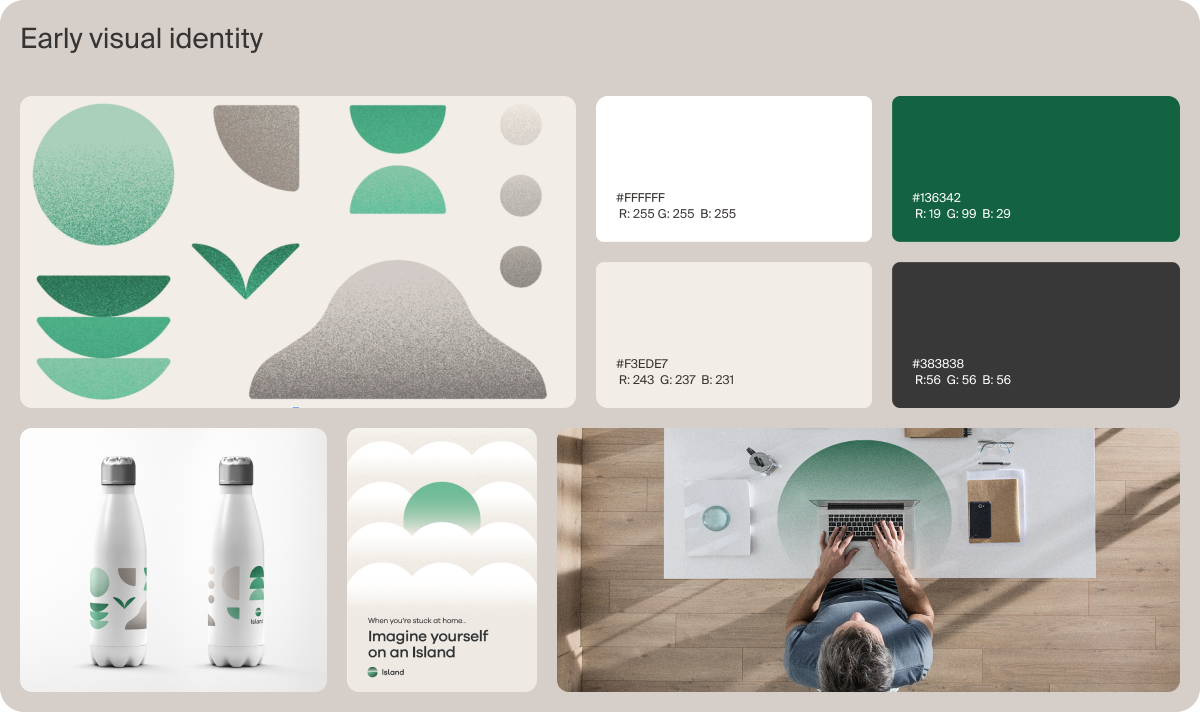
The name Island captures those ideas in a single word. It’s simple, memorable, and distinct. An island protects, but it also invites. It creates space to focus and get work done.
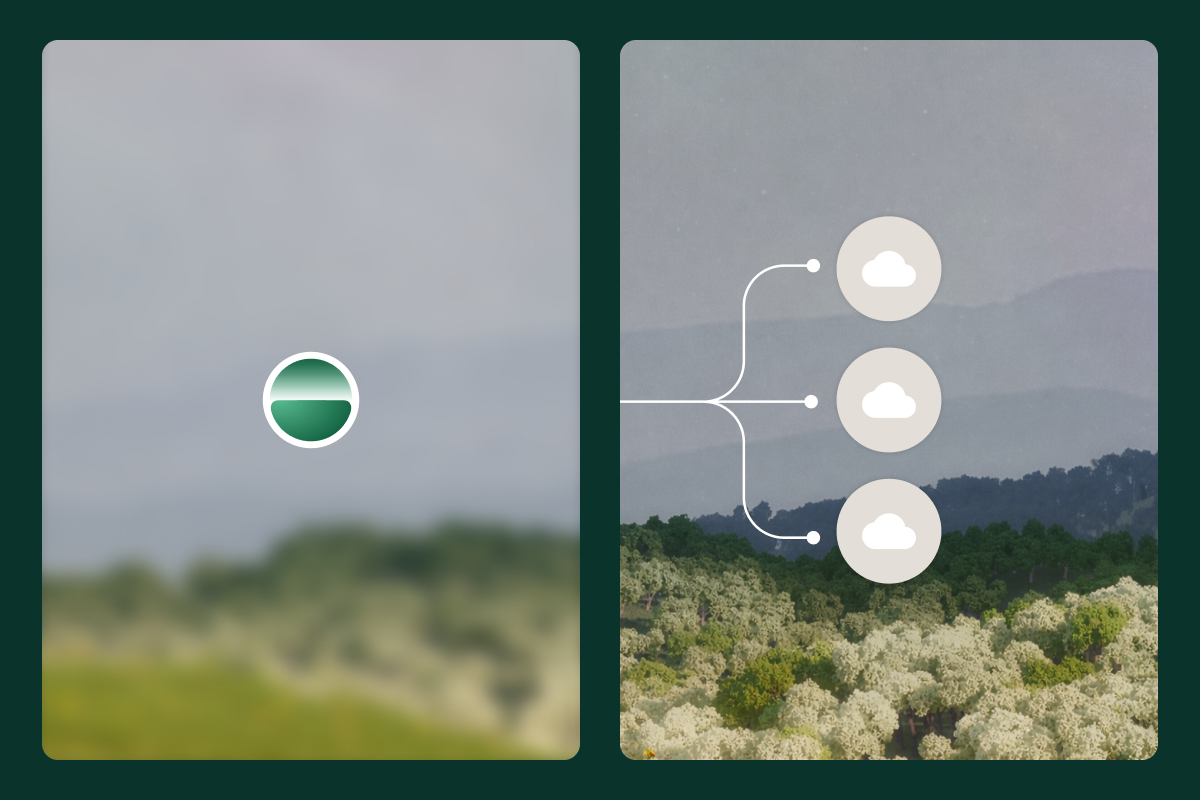
That meaning shaped our earliest decisions. Our logo became an abstraction of the view from an island: a horizon line with a rising sun. The sunrise represented optimism and new beginnings, while the rounded form expressed balance, calm, and precision.
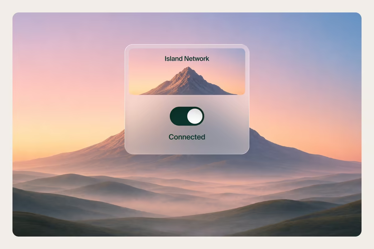
We chose green as our primary color, deliberately moving away from the aggressive palettes common in cybersecurity. Instead of communicating danger, we wanted to communicate possibility. It also symbolizes nature, and from the start, Island has been the place where work feels natural. The ideal environment for enterprise work.
The zen garden: a creative foundation
We found inspiration in the Japanese Zen garden. At first glance, they appear simple. But in reality, every stone, grain of sand, and leaf is meticulously and intentionally placed. Nothing is accidental.
That idea felt remarkably similar to what we were building at Island: A place where everything sits exactly as it should. Where complexity is handled behind the scenes, allowing people to work without friction or distraction.
From this concept, we developed a design language built around simple geometric forms, natural elements, and subtle textures inspired by raked sand.
Our original brand helped introduce Island to the world and establish a new category. As the company and product grew, the brand needed to evolve with it. The challenge was how to evolve without losing what made it recognizable in the first place.
CI/CD for brand
Instead of a massive rebrand that can take months and doesn’t fit the high-paced reality of a startup, we borrowed a concept from engineering.
In software, CI/CD (Continuous Integration and Continuous Deployment) means improving continuously through small, frequent releases rather than waiting for one major launch. We adopted the same mindset for our brand.
Rather than reinventing ourselves every few years, we evolved through deliberate iterations, refining and expanding the system while continuing to ship. The first major opportunity to test that approach came at RSA.
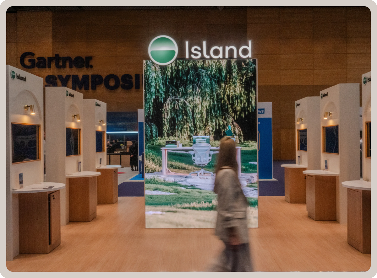
The turning point: RSAC 2024
RSA is the largest cybersecurity conference we attend each year and an opportunity to experiment at scale.
We wanted our booth to feel like an island within the chaos of the conference, a calm, distinctive presence that reflected who we are. To bring that vision to life, we partnered with Yambo, a design and creative studio specializing in 3D, who helped refine our vision, and ultimately bring it to life.
Building on the Zen Garden concept, we created a world where nature and work existed in harmony. Trees, water, grass, and workspaces were rendered in a subtle, calm and harmonious visual style, forming a living environment rather than a traditional booth backdrop.
The centerpiece was a film where elements started slightly out of place before gradually settling into balance. A visual metaphor for what Island does, bringing order and clarity to the modern workplace.
The project became a turning point for the brand.
.png)
A new Island emerges
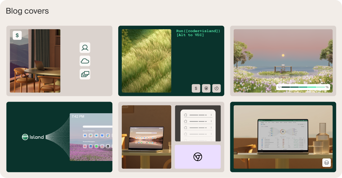
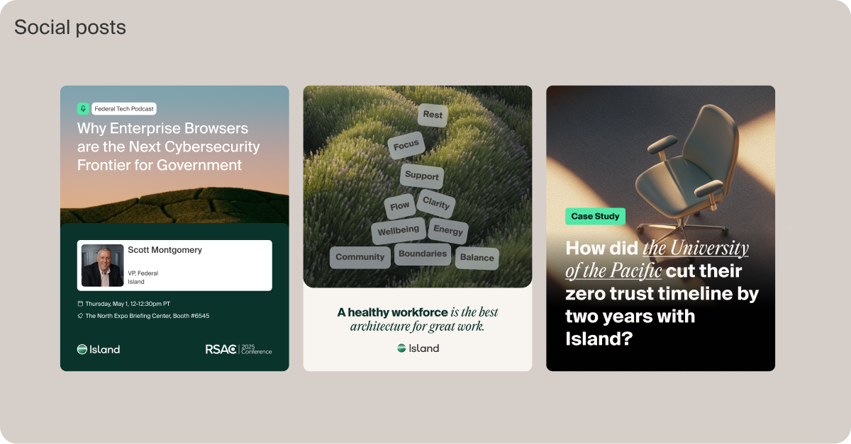
What started as a conference experiment quickly became the foundation for a broader visual system.
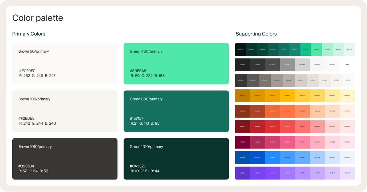
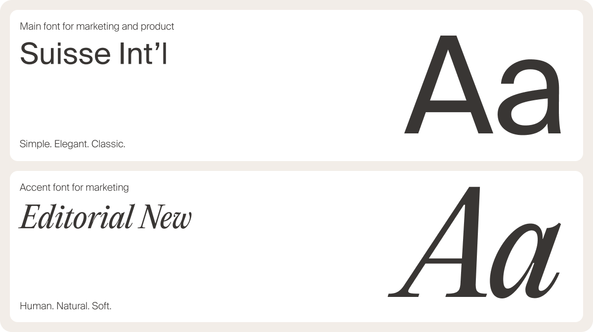
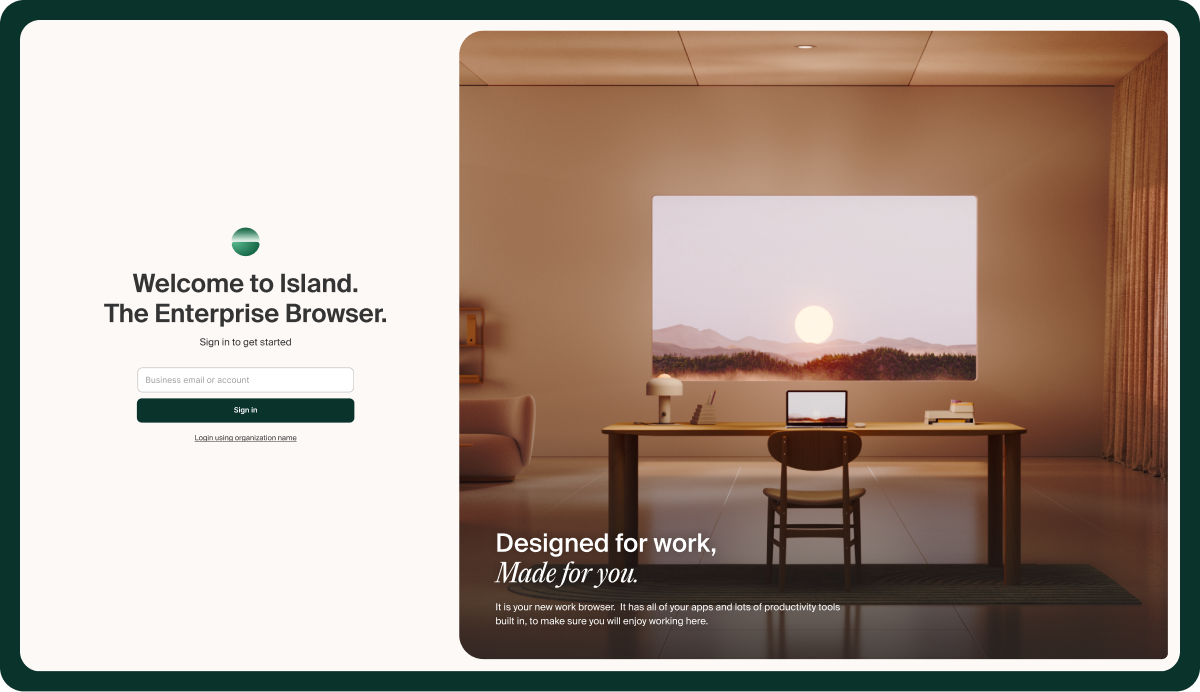
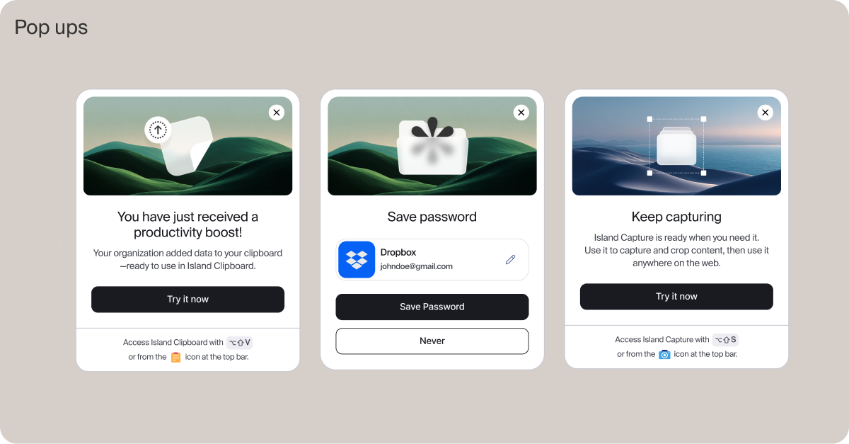
The new language expanded across our website, campaigns, social channels, events, and eventually the product itself. Along the way, we refined our foundations. A deeper, richer green, one strong tone for CTAs, a wide palette shared across brand and product, and one typeface that works seamlessly across both, paired with a serif accent to add a natural, human touch.
The result was a more scalable and consistent identity without losing the simplicity that defined Island from the beginning.
None of this happened overnight. It emerged through a series of deliberate iterations over several months, testing ideas live, learning what worked, and continuously refining the system until it became a cohesive design language.
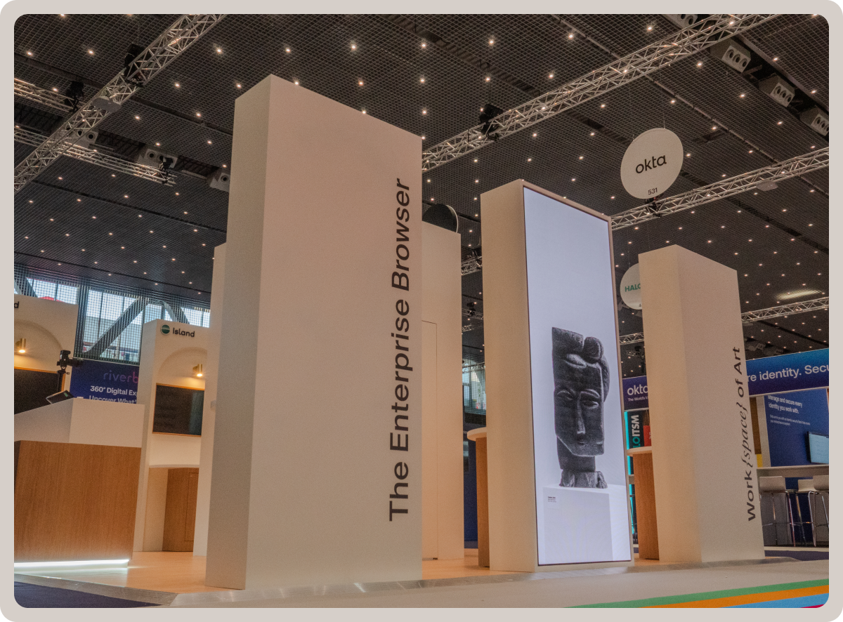
Our next evolution: brand as experience
Our first Gartner Symposium/XPO™ in Barcelona gave us the chance to push the brand further.
Rather than creating another conference giveaway, we wanted to build an experience that felt authentically Island.
The inspiration came from Picasso, the artist most closely associated with Barcelona and someone who challenged conventions by creating an entirely new way of seeing.
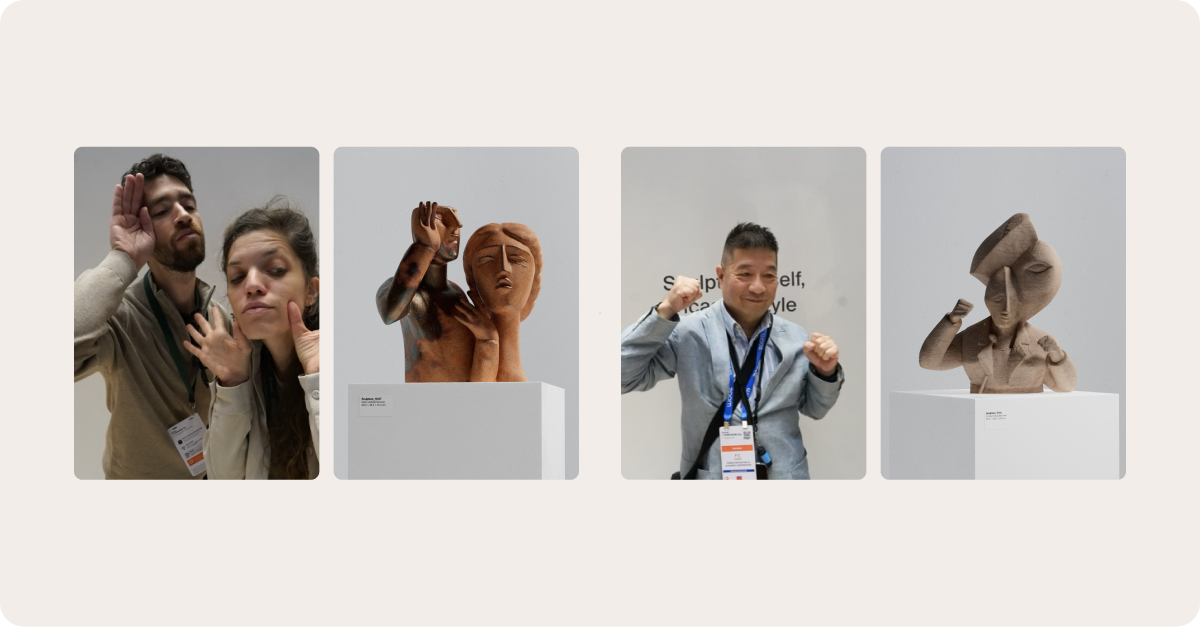
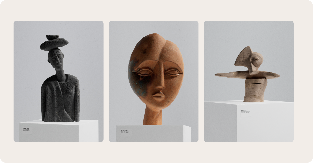
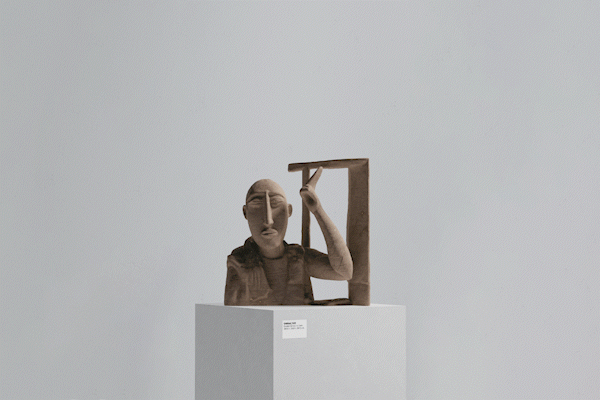
The result was Work{space} of Art.
Visitors could take a photo of themselves, which an AI-powered system transformed into Picasso-inspired 3D sculptures. The resulting portraits were projected across the booth, printed as postcards, and shared online.
Alongside the activation, a large-scale video installation transformed simple workstations into sculptural art pieces inspired by Picasso’s work. The project explored the same idea that has shaped Island from the beginning: changing perspective can change everything.
As the activation unfolded, we heard the same feedback repeatedly. People described the experience as calm, clean, and different.
That reaction captured something we’ve been building toward from the beginning.
Looking back, the Island brand evolved much like the product itself. Not through dramatic reinventions, but through a series of deliberate improvements. Each step expanded the system while staying true to the original idea: making complexity feel simple.
Today, the brand extends across marketing, events, social media, and the product itself. But the goal has never been consistency for its own sake. It’s to create a feeling that enterprise work can be calm, intuitive, and elegant, even when incredibly sophisticated technology is working behind the scenes.
There’s still more to build, more to explore, and more to evolve as Island continues to grow. We’re looking forward to sharing what comes next.
Tami is Head of Brand Design at Island. As its first brand designer, Tami helped shape Island's visual identity from day one, bringing more than a decade of experience in graphic design, and specializing in branding, art direction, and creative strategy. Before joining Island, Tami worked in the brand team at the design agency OPEN, as well as independently, helping leading companies in tech, retail, and other industries shape and evolve their identities.

.svg)
.svg)
